Neat Jobs Web Page Mockup
Overview:
After I had been employed with Neat Companies for about a year, it was decided that the company websites needed a complete overhaul and rebuild. One of our websites, neat-jobs.com, is dedicated solely to learning about employment opportunities with Neat Companies and being able to submit applications for open positions. At that time, the site had essentially no design whatsoever. It was little more than a plain white landing page that only featured a bland plug-in portal to a separate website used by our HR Department to process applications. I was tasked with creating static mockups to showcase in a meeting where I would explain my vision for the future of the site.
Objectives:
Naturally, I wanted this website, along with all the other company-affiliated sites we rebuilt during this project period, to reflect the brand identity of Neat Companies. I understood the benefits of having separate URL’s for each subsidiary of Neat Companies, but I knew it was crucial for them all to have a connected presence. Once basic design strategy was established, the main goal was creating the most user-friendly experience possible.
Process:
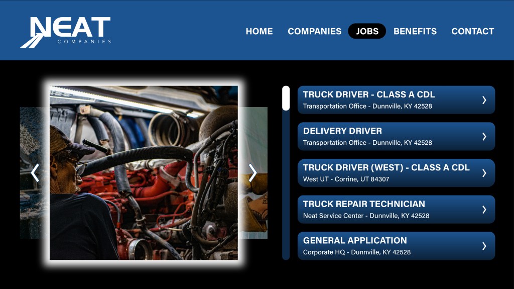
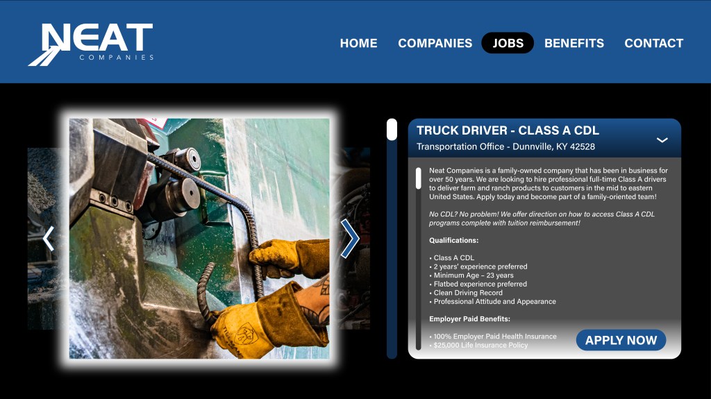
I knew I would be able to convey the most important points necessary for my colleagues to understand my approach through two static mockups, which are the ones you see here. The first one showcases what the user would see upon first visiting the “Jobs” page. The second one expands on the concept by showing what would happen when the user clicks on one of the available positions listed. I had played around with the idea of having the scroll bars on the left side in their respective elements rather than the right, but ultimately I’m glad we didn’t incorporate that on the real website. You just never really see that particular layout choice, and I think it would have been a hinderance to the user experience rather than an aid. I thought using a photo carousel to show action shots of different positions in the company provided a necessary attention-grabbing element to this page. It would automatically rotate to the next image in the carousel every few seconds unless manually rotated by the user using the directional arrows. The first mockup shows the standard appearance of the arrows while the second mockup shows a concept for a hover effect over the right arrow. The job positions would be structured as a list of dropdown buttons, made evident to the user through the incorporation of the arrows seen on the right side of each button. Upon clicking anywhere in the bounds of the listing button, it would expand downward, providing detailed information about the position and the button to apply, which would take the user to the aforementioned site used by our HR Department for processing applications. Users would be able to scroll through this dropdown element and read as much as they’d like about the position, with the “Apply Now” button remaining in a static position ready to be clicked at any point regardless of how far the user has scrolled down within the element. My presentation did land very well among my colleagues, and for the most part, this vision is what came to life on the website.
Side Note:
The only major drawback, and frankly one that was enough for me to almost not include this as a portfolio piece, was that I was heavily pushed to use Wix as the site-builder. I want to be clear that I have nothing bad to say about Wix, whatsoever. I think they provide an excellent service and I like a lot of the functions available on their builder. The problem is that I am much more experienced with Wordpress, which is what I used to build this portfolio website. My only criticism of Wix is the forced adaptive shifting of elements depending on the screen size of the user. I know there is some of that to deal with on Wordpress too, but I find it much easier to work with on here. I say all of that because I have provided a link to the Neat Jobs website in a button under the mockups attached to this piece. Everything may appear fine on your screen, but I know there are some where it does not, and in full transparency, I was never able to figure out how to build on Wix in a way that would look good for all screen sizes. It appears much better on larger desktop screens as opposed to smaller ones. Perhaps I was overlooking something in my research. For anyone reading this who may have the solution to my dilemma, I would certainly love to know what it is! I’m always willing to admit my limitations and where I could benefit from growth in my learning!
Southern States Social Media Graphic
Overview:
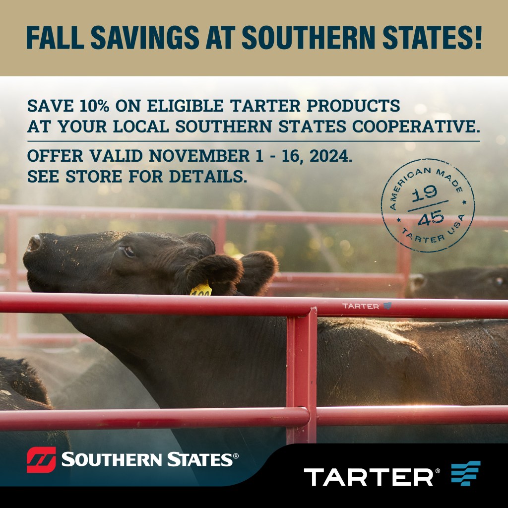
One of my main responsibilities at Neat Companies is oversight of our cooperative advertising program. Essentially, vendors who sell our products can opt in to this program to receive access to creation of joint advertisements as well as partial reimbursement for the ad run costs. I coordinate with our participating vendors, create the ads, and help process payments for reimbursement. We work very closely with Tarter Farm & Ranch, and they offer the same program for their vendors. I often create advertisements for both companies depending on the vendors I am working with on any given day. This particular ad is a Tarter one for one of their vendors, Southern States Cooperative.
Objectives:
My contact at Southern States informed me that they were interested in running a boosted social media post to promote their Fall Savings deal on select Tarter products.
Process:
The majority of Tarter products that were on sale for this promotion were livestock gates, so that’s what I chose to use as the focus. Southern States is a large vendor with several locations spread across the country, so each region of stores has varying Tarter products and pricing. Due to that fact, we were unable to incorporate a link that would lead viewers to any specifics about this promotion. Instead, we used a call to action prompting viewers to visit their local store and inquire further. Beyond that, it’s essentially a standard ad design for social media, incorporating the company logos and the “American-Made 1945” brand asset that Tarter was heavily pushing at the time.
LakeNet Media Logo Rework
Overview:
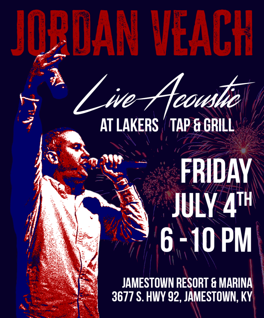
Jordan Veach is a local to Russell Springs, KY who performs live music at surrounding venues on occasion. He was set to perform at a newly opened restaurant located at the Jamestown Marina on Lake Cumberland for their 4th of July celebration. He reached out to me about creating a graphic he could share on his social media to raise awareness for the event.
Objectives:
Of course, with this being a 4th of July event, Jordan wanted the theme of the graphic to reflect the holiday. He provided me with the copy he wanted to use on it, as well as a selection of images from his previous performances to choose from. Unfortunately, most of the images he provided appeared to be either screenshots from videos or likely taken on devices that didn’t support high quality photos. Since he performs live acoustic, my preference would have been for him to be holding a guitar in the image used, but we weren’t able to work that out. Ultimately, the image used is still good and lets the audience know that Jordan likes to have fun while he’s performing. Accounting for the possibility that he may have even wanted to print some handouts, I decided to create a design that would work as a social post, flyer, or poster without needing alterations.
Process:
The most important factor for me in this design was how I would present the image of Jordan. I wanted it to be stylized in a way that fit with the theme, rather than just pasting in a photo of him with no edits. The obvious color palette to use for this was red, white, and blue, which gave me the idea of creating a three-color posterized edit of his photo. Essentially, I wanted this design to have a healthy harmony of vintage and modern style, because Jordan’s music set featured both classic songs and newer songs. The vintage aspect is seen through the rough, grainy texture applied to the photo of Jordan and the heading with his name. The modern aspect is seen through the cleaner copy used throughout the rest of the design and the high quality image of the fireworks in the background. Jordan was very pleased with the finished product, and he had a great turnout that night!