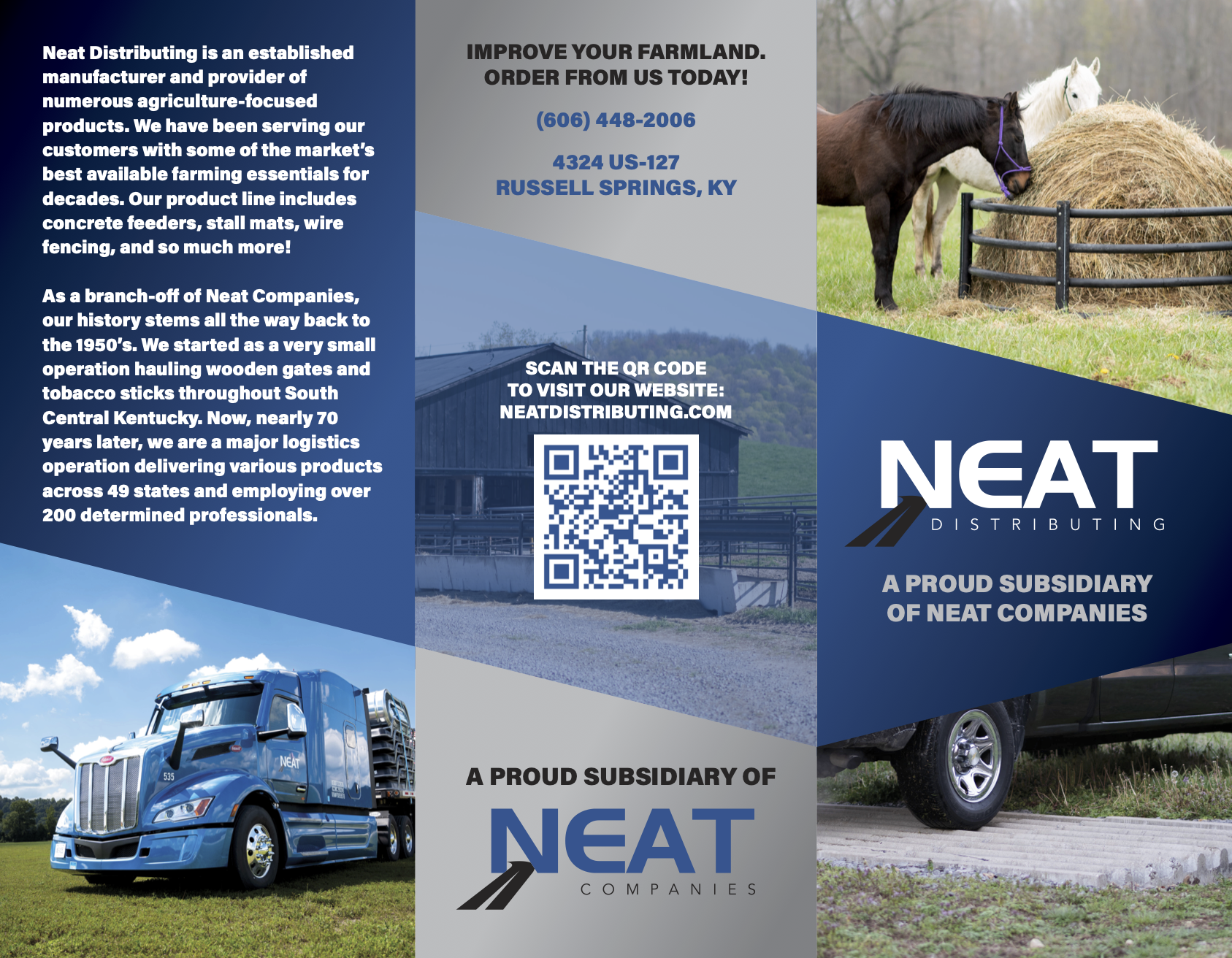
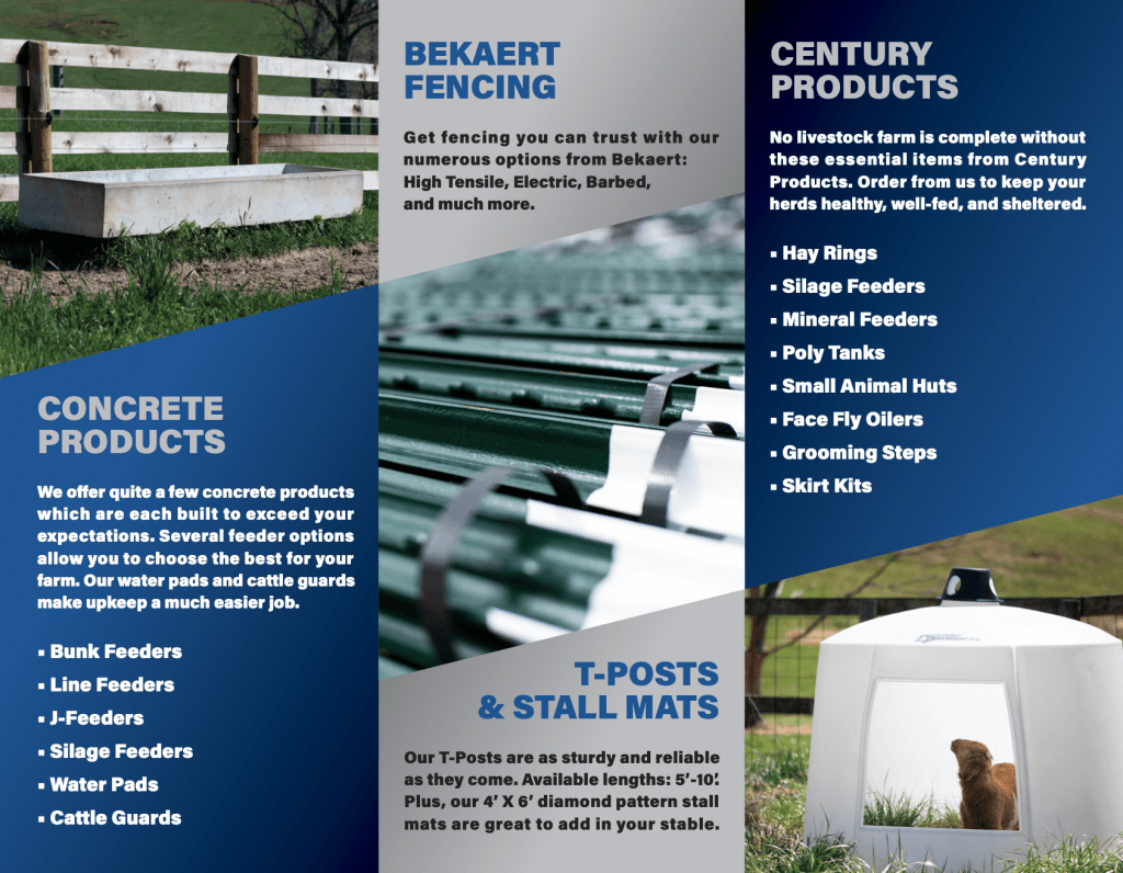
Neat Distributing Tri-Fold Brochure
Overview:
As a multi-faceted business, Neat Companies is always doing what it can to help their clients be made aware of each subsidiary under the Neat umbrella (in this case, Neat Distributing) and better understand their offerings/functions.
Objectives:
This brochure is intended to be passed out in any setting, but especially at vendor trade shows. The information presented about Neat Distributing needed to be all-encompassing, but not too in-depth. I wanted something that would easily resonate with potential vendors and potential end-users, enticing both audiences to inquire further about our business.
Process:
First and foremost, I had to determine a design strategy that fit into the brand identity. As a well-established manufacturer and provider of agriculture/construction products, Neat Distributing’s brand can be summed up in the following statement, “We are proud to be a company with historic roots that stretch far back, but our best qualities are found in our forward-thinking attitude, innovative ambition, and adaptive ability in an ever-evolving industry.” The design style of this brochure is intended to convey that Neat Distributing is a serious player in the modern era of agriculture and construction; a clean, refined presence as opposed to a more old-fashioned, rugged one. Naturally, the color scheme fell right in line with our corporate colors. Many times, when I am designing a tri-fold brochure, I really like to make the design flow seamlessly across the panels. I want each panel to be visually pleasing on its own, while also clearly being one part of a whole, communicating with the other panels it shares this space with. I find this particular design strategy to be a clear winner on brochures, because it perfectly reflects the nature of their content, in most cases: A “big picture” message broke down in individual sections. From there, it’s only matter of utilizing the real estate effectively, striking the right balance between the images, copy, and negative space. The great part about working for a large company that keeps organized media files is that you have several image options to choose from for these projects. I was very meticulous about making sure to use images that fit well in the frames I had laid out. It’s equally important to have excellent copywriting skills. I had to be able to make the necessary tweaks to the copy because I was dealing with limited space while also trying to maintain a visually pleasing structure.
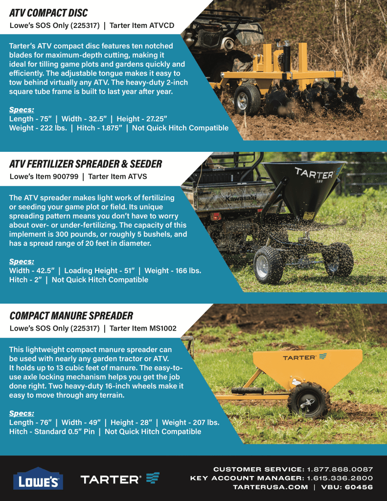
Tarter/Lowe’s Flyer – ATV Implements
Overview:
My employer, Neat Companies, has a sort of symbiotic relationship with another large agriculture product manufacturer, Tarter Farm and Ranch. In my role, quite a bit of the graphic design work I did was for Tarter products. Lowe’s is a top vendor for several Tarter products. This flyer was needed to boost sales for their ATV Implements line.
Objectives:
Knowing that the main target audience for this flyer would be Lowe’s customers who are already in the store, my main priority was to create something that already provided answers to almost any question someone may have about these products. Where the Neat Distributing brochure was a light information overview of the business as a whole, this is an information-heavy spotlight on a very specific set of products offered by Tarter.
Process:
When you are creating a flyer that you know is going to be loaded down with copy, your layout options do start to become limited. However, that doesn’t mean it has to be dull. My main priority is always presenting the information to my audience in the most attention-grabbing way while making sure it’s still easily legible and structured to effectively eliminate any possible confusion. At the time this flyer was created, Tarter’s logo featured a bold, eye-catching cyan hue. I always tried to use that boldness to my advantage in my designs for them, which is why it is so generously used here. I also felt that using lifestyle images of the products “in action” would create a much stronger impact on potential buyers than seamless images would. The plan was for this flyer to be placed in close proximity to the corresponding product section in the Lowe’s stores. I knew a much larger portion of the audience for this would likely be customers who would value knowing as much as they can about these products as opposed to just wanting something Tarter brand. With that in mind, I wanted the space for product images and information to take priority over the logos, which is why they are only included in the footer. I made sure to use a black background in the footer to offset the cyan, which ensures it won’t be easily overlooked by the audience.
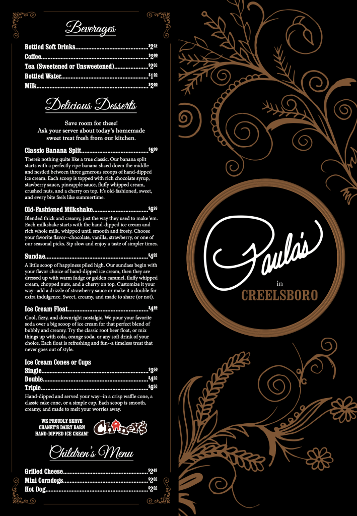
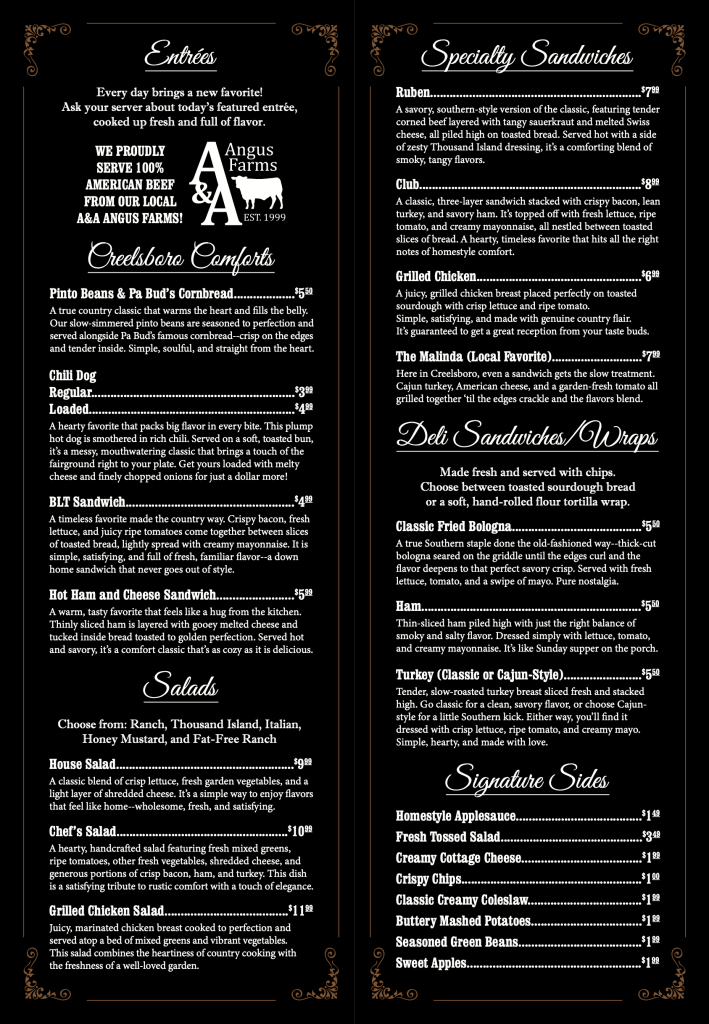
Paula’s in Creelsboro Menu
Overview:
Paula’s in Creelsboro is a new take on a historic country store and restaurant that has been in Creelsboro, Kentucky since 1876. The owner reached out to me to help establish her business. One of the many projects I completed for her was designing the food menu.
Objectives:
This was a pretty straight-forward project. I had already helped Paula craft her brand image from scratch. She heavily utilizes chalkboards in her store and restaurant for product sections, general greeting signage, and updates on the rotating entrees or seasonal offerings. We wanted to combine that aesthetic with a rustic one to emphasize the establishment’s historic roots in the community, hence the handwritten white-on-black font for “Paula’s” and the bronze-plated style used for “Creelsboro” and the circular frame of the logo. As is common in this line of work, much of what I created from that point needed to fit into that framework we had established, which you can see in this menu design.
Process:
Again, menus are pretty straight-forward work. 90% of what you are doing is making information fit in a limited space while flowing in an easily digestible fashion. It may not be obvious to some from this layout, but the menu is split into four different panels and folds vertically in the middle. The first page you see here is the back of the folded menu on the left panel and the front of the menu on the right panel. The second page you see are the two interior panels you see when you open the menu up. We chose to use vine foliage vectors on the prominent front panel elements and in the corner ornaments of the other panels because while part of the brand identity focused on southern charm and elegance, it also needed to reflect the agricultural community and natural beauty of Creelsboro. Paula was adamant about wanting each menu item to have a detailed description specifically meant to make the reader’s mouth water. Everything needed to sound delicious. Of course, this made for a heavy amount of copy. Paula knew the vision she had for this, so she took it upon herself to type up the majority of this copy. My job was to dress it up. My main concern was ensuring we kept the copy at a size easily legible for most people. All factors considered, the panels being much more tall than wide was the layout option we were satisfied with, and it worked very well. Initially, I wanted the copy for the menu item names to be the bronze hue, but I knew that might affect legibility. Sure enough, after requesting a test print, I found that to be problematic. Fortunately, even using white on those copy sections still resulted in a very nice menu design. I suppose it could be debated, but in my opinion, function always trumps fashion in this job, but it’s always nice when you can find the happy middle.