LakeNet Media Logo Rework
Overview:
The owner of LakeNet Media had been operating for a few years with a logo he had created, himself. As he made plans to grow LakeNet’s presence, he reached out to me to help give his logo a professional polish.
Objectives:
The main issues the client wanted addressed were as follows: optimizing the logo for use as an app icon and social media profile images, adjusting the “L” of the logo icon to have a more consistent thickness throughout its shape, and experimenting with incorporating additional logo elements.
Process:
Keeping in mind the first issue of optimizing the logo for app/social media use, I knew I wanted to take a stab at recreating the “LN” icon in perfect square dimensions rather than the semi-rectangular ones in the client’s original version. The idea in my mind was that the app icon and profile images would just feature the “LN” and therefore, having it perfectly squared would achieve better visual balance. After taking care of the “L” thickness in the logo icon, I felt the need to create a breakdown for the client to read over, which is what you see in the first image I’ve included. Some of the things the client wanted to see out of these revision requests were incompatible with each other. The client was sold on the idea of the logo icon’s square reshaping. Once we got that settled, I went to work on the logo as whole. I found a thick sans serif font that looked roughly similar to the “LN” icon, and after some tweaks to make it match as close as possible, was able to create the “LakeNet Media” portion of the logo text. I found a thin, modern sans-serif font for the “Podcast Network” portion, which I felt was a fitting contrast to the thickness of the other font. The last thing to do was brainstorm and test out graphic elements we could add to the logo to help signal that it’s a podcast. The client had initially pushed for a microphone symbol inside of the “LN,” but I found it to be too clunky. After some trial and error, I ended up trying the idea seen in the second image, and the client loved it. By rebuilding the “LN” as outlines rather than solid shapes, it was able to flow perfectly with two simple curved lines which indicate sound. A simple, yet elegant addition that signals exactly what LakeNet Media is, just as the client requested.
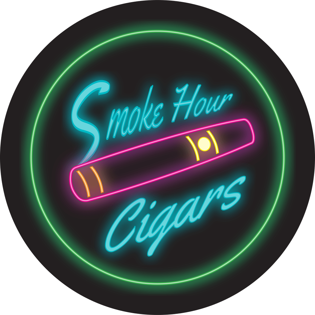
Smoke Hour Logo Variations
Overview:
A friend of mine decided to start his own business selling cigars. He was familiar with my work and asked if I would help him craft a logo.
Objectives:
Although Smoke Hour ended up as a delivery business, the original plan was for it to have a storefront with a lounge, as per usual for most cigar businesses. The first version of the logo was created with that in mind. The client’s only request was for the logo to feature gold and have a classical, vintage vibe. The second version of the logo was created once the client had settled into the idea of a delivery business, hence the name change. It was also specifically for upcoming summer events they were setting up booths at, so they requested a neon sign variation to give it a retro, summery vibe.
Process:
When deciding how to lay out this logo, I was trying to consider every factor of how it could potentially be used by the business. While keeping in mind the direction that had been given to me by the client, I was also thinking about things the client would likely want this logo to be on. From eye-catching storefront signage, the coasters for drinks in the lounge, and maybe even labels for their own cigar brand (which had been discussed as a potential future endeavor), I recognized a circle to be the most versatile choice for a framework. From there, I designed the cigar, placed it in the middle of the circle, and started formulating ideas for the text. Pretty quickly, I saw the opportunity to use the smoke of the cigar as the “S.” I found a script font that fit the vintage vibe my client was looking for and also worked with the smoke “S” idea. After a few more color scheme decisions, the logo was complete. Obviously, aside from the style and slight name change, the neon version of this logo is essentially the same.
Walnut Hill Transport Logo
Overview:
Another friend of mine works for his father’s trucking company. They have been toying around with the idea of updating their logo. My friend came up with a concept and asked me to take a shot at creating it.
Objectives:
The client had a very specific vision in mind which was essentially a style combination of antique and rugged. He wanted the logo to convey that this company is well established in the community and they aren’t afraid of hard work.
Process:
I started by finding a script antique font for “Walnut Hill.” I needed to make sure this font had a healthy amount of stroke weight because the client wanted it to have a chrome effect. After applying the necessary color alterations to the font, itself, I added the sparkles, being careful not to overdo it at risk of making it look too glamourous. From there I found a rugged sans serif font to use for the remaining text. Since this section of the logo was using the rugged font, it didn’t fit for it to also have the chrome effect, but I did want to make sure there was a connection to the “Walnut Hill” section. I chose white for the color to closely match the chrome, and gave both sections a drop shadow effect. The “Liberty, KY” section still needed more to distinguish it from “Transport.” Employing the use of a third font type would look too busy, and it certainly wouldn’t have looked good to use the script font again. Since the client had also specifically requested a blue background, I felt the best option was to stick with the rugged sans serif, decrease the size, and change the color to black. This satisfied my concerns while still working nicely with the color scheme.
